CASE STUDY: A Message from One Century to The Next
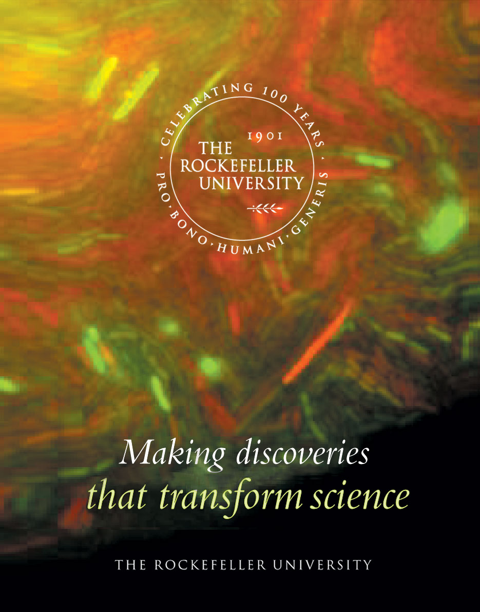
THE ROCKEFELLER UNIVERSITY: Centennial celebration
branding, print, interactive
PROBLEM
How can we achieve the university's goals without alienating current stakeholders?
The Rockefeller University community had a deep love for their current symbol which was hand drawn when the university was modernized in the 50s. Many were opposed to any changes, not only to the symbol itself, but to all visual elements,
The University's new president presented a daring academic plan to position Rockefeller as a leader in biomedical science in the next century. The University needed to signal a change, reach out to new audiences and initiate a Centennial Campaign.
PROCESS
To understand the university's needs we began the project by listening to input from representatives of the over 2000 faculty, students, postdocs, trustees and friends working on Rockefeller's 14-acre campus.
The academic plan provided the scaffolding upon which we built our strategy to showcase the university's scientists, bring new audience's on board and ultimately provide a foundation for the future.
SOLUTION
Using the university's illustrious history to accentuate today’s groundbreaking research demonstrated Rockefeller University's plan to approach its second century with the same sense of adventure and inquiry that inspired its birth.
Honoring the past while emphasizing today’s university emphasized the continuity of the spirit of discovery,
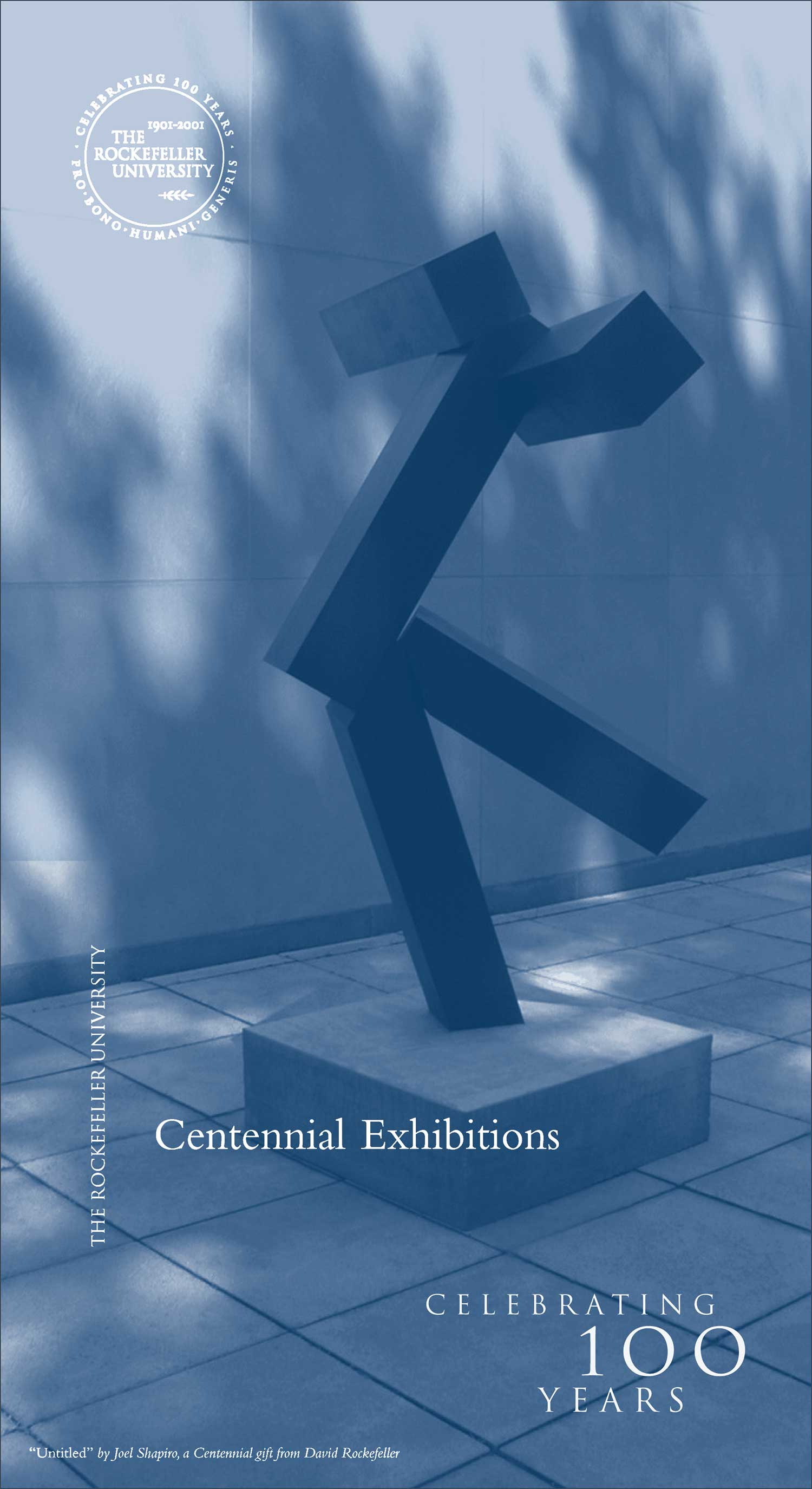
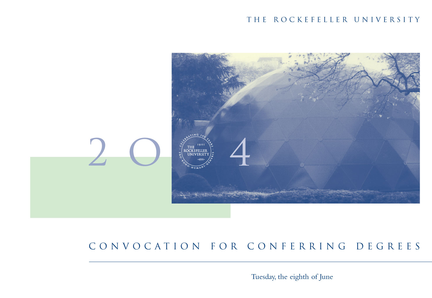
Investment in continuity had many stakeholders opposed to any changes. To maintain the spirit of the university's seal we tweaked the existing symbol, adding a date to emphasize the centennial and refining colors.
How does an institution pay homage to it's illustrious yet not well-know history, while opening opportunities for the future?
By honoring the University's storied past while exploring their commitment to the promise of science for the next generation.
The project incorporated not only centennial branding to drive integrated marketing and communications, but also community building to influence the public’s experience of scientific research.


To bridge the perception of Rockefeller as isolated and it's science inaccessible we defined our audience broadly . . . from RU alumni, students, faculty, and staff, to business leaders, academics, designers and the media.
To create a dialogue with the non-scientific New York community, Rockefeller sponsored a series of events examining the connection between art and science, a natural given the university's historic and contemporary architecture, art and music programming.
To foster dialogue about the discoveries taking place on campus, events were planned to inspire the public to view science through other lenses. The integration of Science with Music, Art, Theater, and Architecture increased our prospective audience.
The public was invited on campus to tour sculptures on loan from the Museum of Modern Art's (MoMA) Sculpture Garden was installed on the upper level of the Dan Kiley designed landscape. (MoMA's Sculpture was undergoing renovation at the time..) MoMA's curator Glen Laurey's presentation on the process inaugurated a new lecture series.
Partnerships with the The 92nd Street Y and the Architectural League lead to lecture series on the intersection of science and the arts. Speakers included Billie Tsien, Tod Williams, and James Stewart Polshek.
The Abby Aldrich Rockefeller Sculpture Garden is an integral component of the Museum's display areas. It's an outdoor gallery, carefully defined, that engages with the urban rhythmic space of New York.
Glen Lowry, Sculpture Garden Tours,
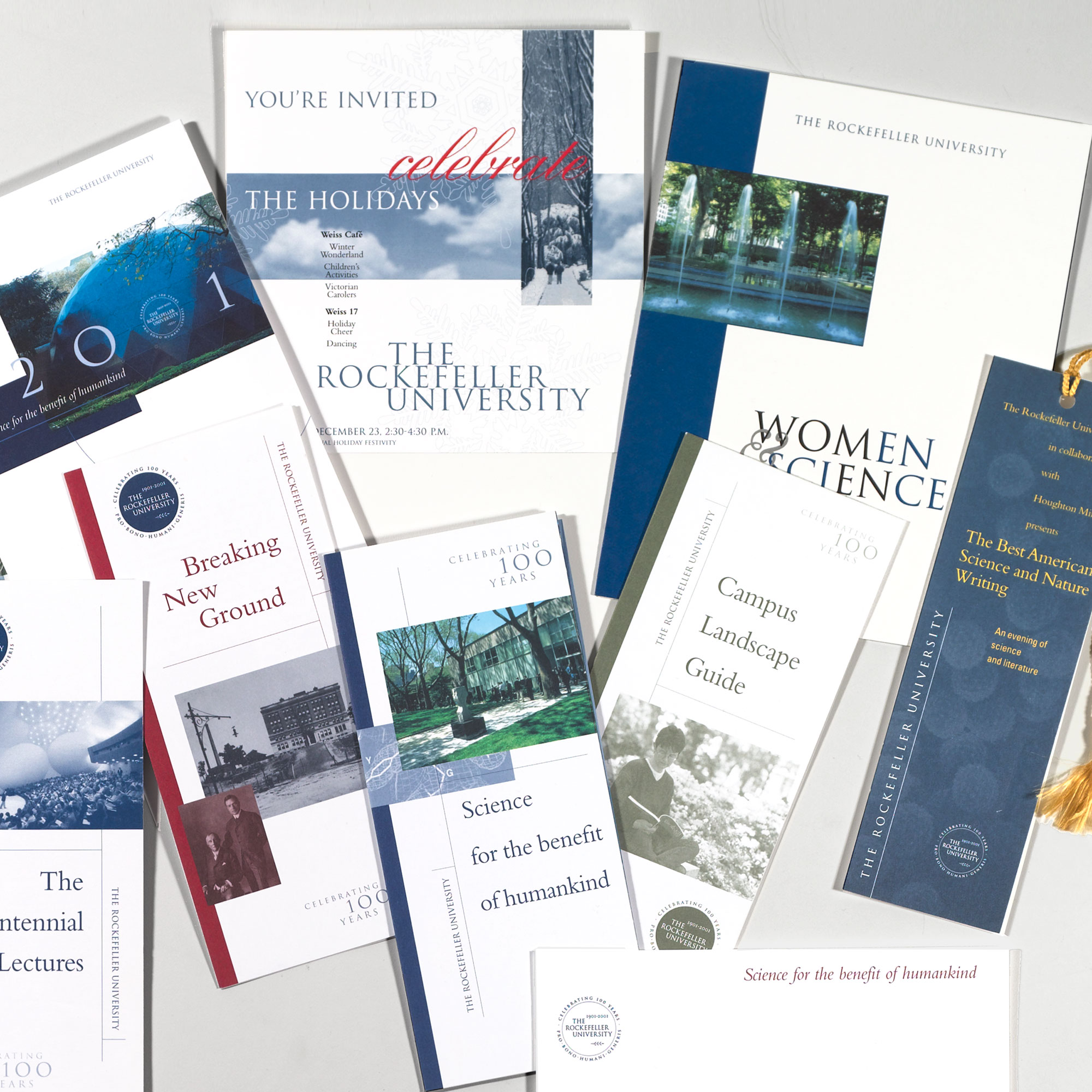
We carried out branding to all events and environmental graphics including on-stage branding, directional signage, printed materials, and branded items.
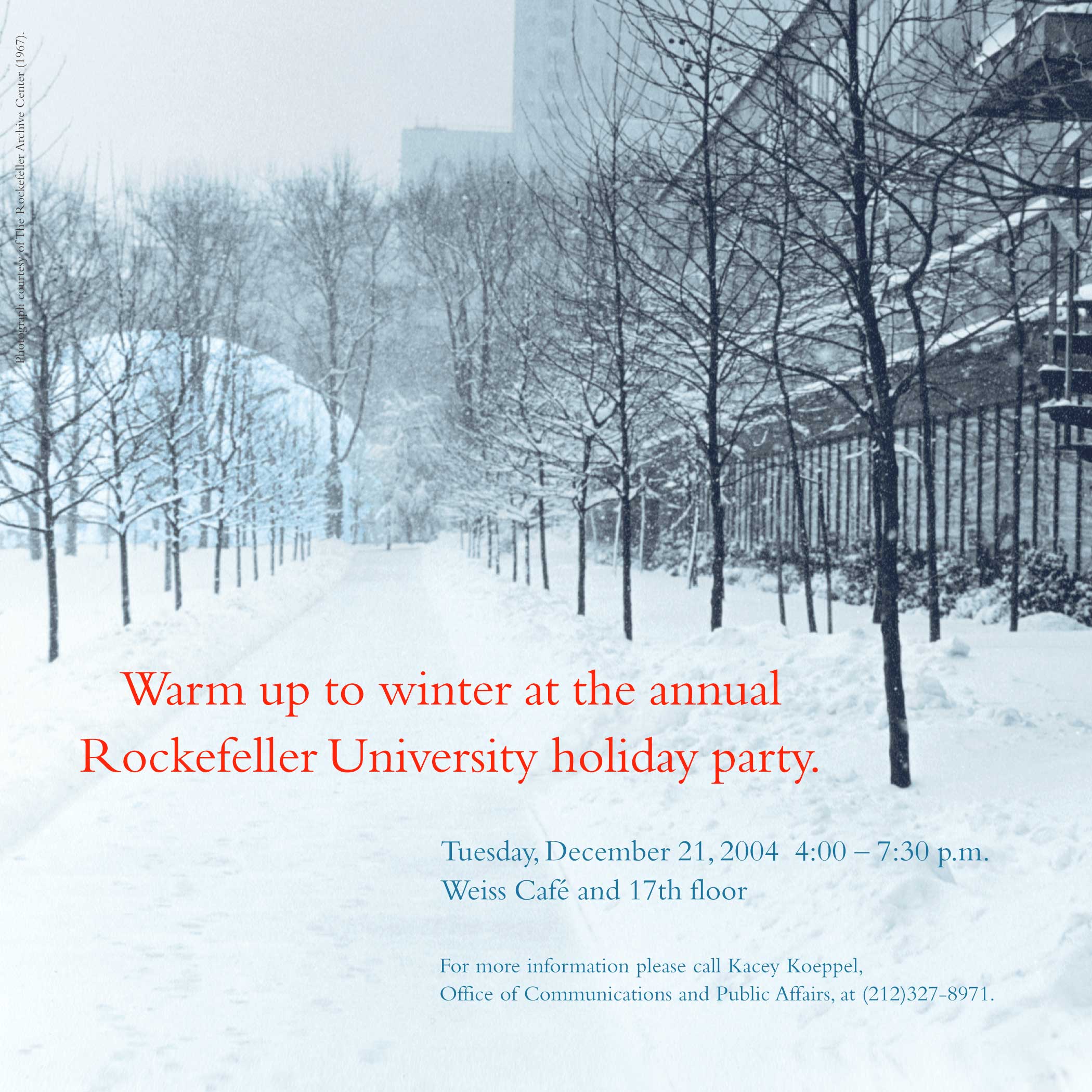
Invitations and new banners proudly proclaim the centennial year.

Branding is applied fluidly, allowing each brochure to provide the needed messaging.


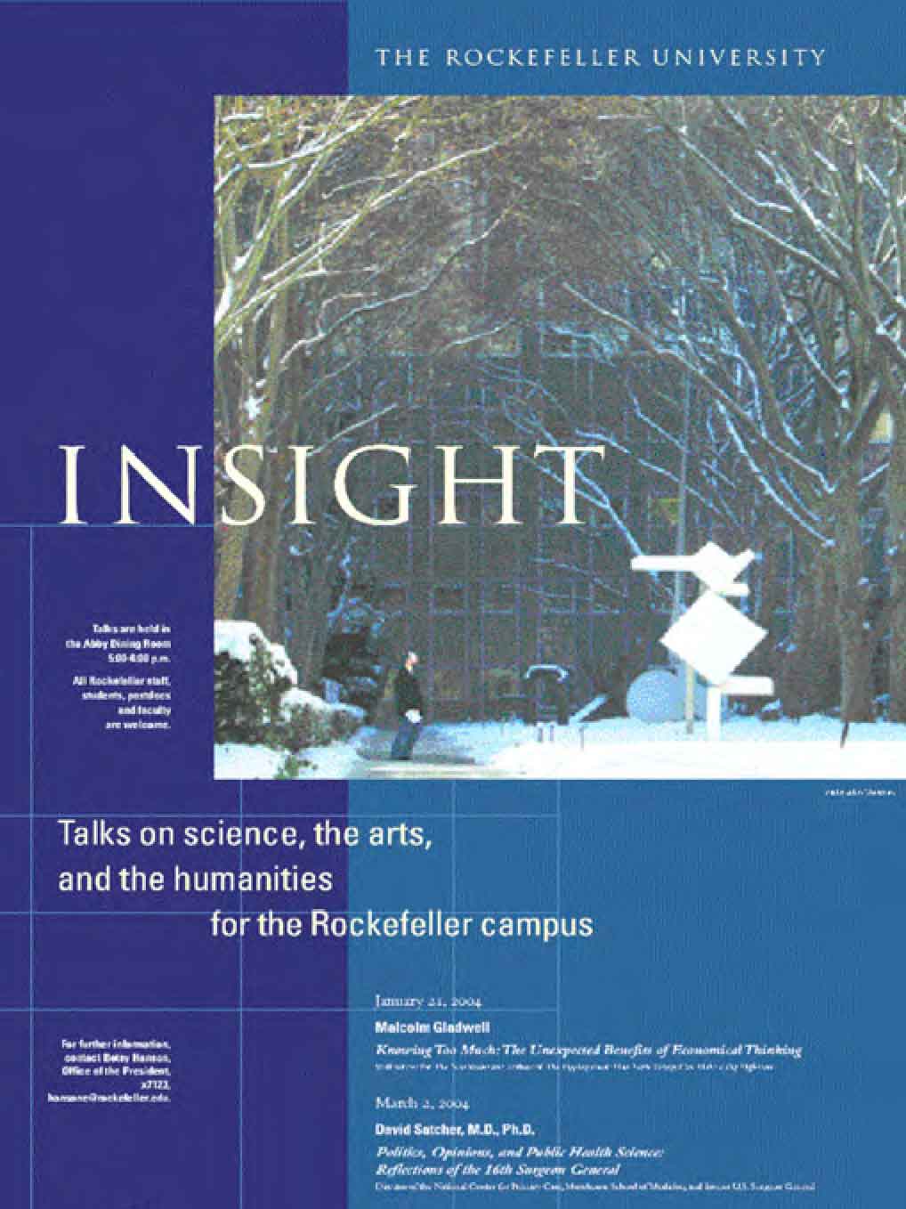
To facilitate communication we sent a bi-monthly newsletter.
The Scientist
Bi-monthly newsletter
We updated the bi-weekly newsletter using typography, color and photography to create a dynamic presentation.
Dynamic focal points integrated within a structured visual hierarchy maintain the "scientific" integrity of the presentation, a must for the scientific articles.
Although the revised newsletter "looked more designed." the researchers did not feel the content was watered down.
The revised format helped the "science appear more approachable." We acquired a more diverse readership,

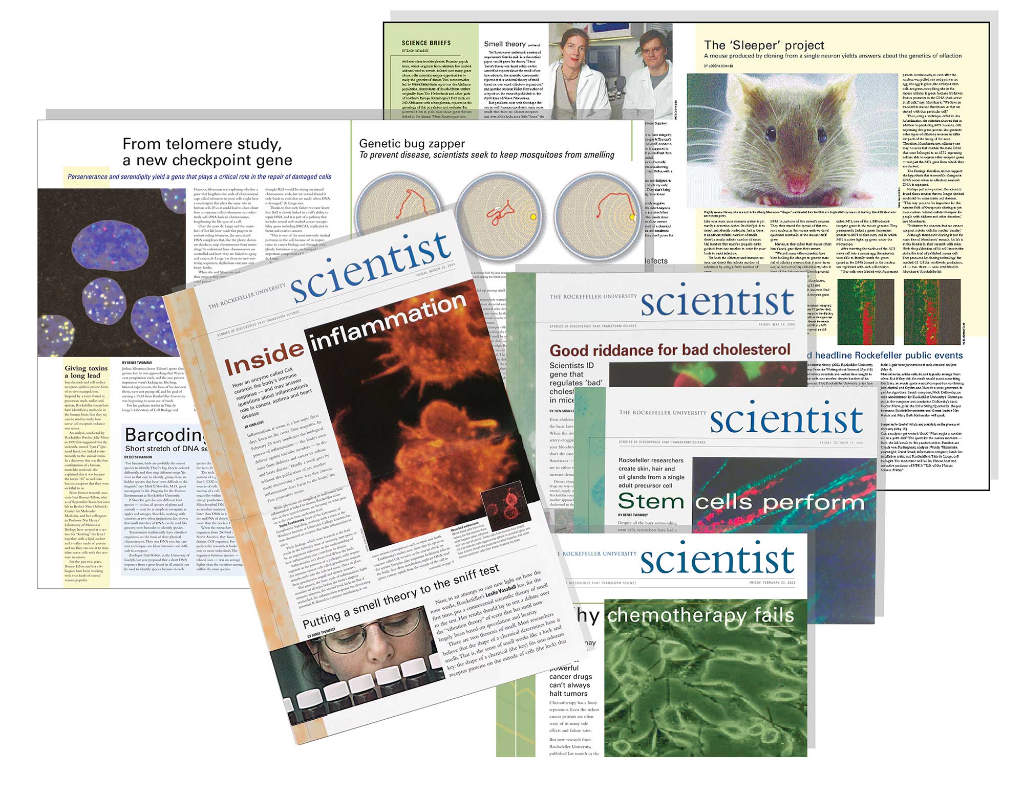
An email newsletter increased our international audience.
Science in a Byte
Articles were based on current scientific findings at the university but written for lay audiences.
Science in a Byte initiated a system of “repurposing” magazine art and articles as an electronic newsletter. The newsletter, a bi-monthly email, contains reprints of science articles and images from our internal newspaper. With minimal additional time and expense we developed and maintained a continuing relationship with a new international audience.
We advertised in the Wall Street Journal, New York Times, and Herald Tribune. Within weeks we had an international audience.
To make complex scientific processes more accessible we created interactive modules.

A combination of image and text calls attention to the innovative research and culture that has constituted Rockefeller University's history of innovative research: a message that establishes Rockefeller's leadership in future of science.
Design, storytelling and branding all played a role in the creation of the 18-month project celebrating 100 years of leadership in education and research,.
To maintain ties to the beloved symbol we decided to maintain the circular form and calligraphy but "tweaked" it by adding the date to emphasize the centennial.
The combination of symbol, text and image with color made the symbol fresh. Reinvigorated the existing symbol and historic interiors with the classical but oversized typography emphasized the update but honored the university's history.
The project received five CASE awards and an advertising and marketing publications award from the Association of Graphic Communications.